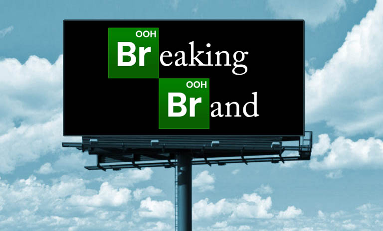
Breaking Brand – When it’s ok to throw branding out the window in OOH


Sometimes it’s ok to make an ad that’s a little off-brand so it gets more views, rather than to have a dull ad that doesn’t get seen.
Don’t get me wrong. I love a good set of brand guides. It leaves no question as to what colors, fonts, and imagery to use on your billboard ad. That being said, most of the ads we do are for advertisers without these guidelines. They do though, usually have a logo and a color scheme to base the design off of. Sometimes being tied to these restrictions can create mundane, boring ads. That may be ok for banks and hospitals, but sometimes you need to throw the branding suggestions to the wind and let the creativity fly.
Colors
If you want an Out of Home ad to pop, grab the eye of the passerby, and get the attention it deserves, you need to add a bright color. Colors like red, yellow, orange, neon green, and pink draw the eye to the ad. Whereas colors on the opposite side of the spectrum tend to blend into the environment. Like blues, greens, and browns. If your advertiser’s color scheme is in this family, you can add a pop of color to the background or headline to help get some needed impact. Adding a single pop of color won’t change the advertiser’s overall branding too much.
Need help picking complementary colors? Check out this free online color tool: https://colorschemedesigner.com/csd-3.5/

Which ad draws your eye? Just a simple addition of yellow goes a long way in this ad.
Images
Let’s say you’re working with a rather reserved advertiser. Their branding images on their website and social media are plain, sterile, and lackluster. They want a new ad that gets as much impact as possible. For that to happen, you’ll have to break brand and try a more compelling/in-your-face image.

Which ad draws your eye? Obviously, the ad on the right is more catchy and memorable. So don’t be afraid to think outside the brand guidelines box. Get creative!
—
Related Posts: