So you're getting a billboard...

That’s great! Here’s what you need to know to maximize your ad’s potential.


About this page

Your billboard company has sold you a great location. Now it’s time to get a great piece of artwork on the board. We love billboards and want your billboard to get you the most return possible. We’ve used our decades of experience in out-of-home advertising to put together a few easy-to-follow guides to ensure the maximum impact of your billboard. This page is generally for advertisers who are creating their own billboard ad design or sending the billboard ad idea to a designer to create.

Step 1: Billboard Size
.
Your billboard account representative has likely emailed you the dimensions or a spec sheet. This information tells you what size to design the billboard at.
Your billboard account representative has likely emailed you the dimensions or a spec sheet. This information tells you what size to design the billboard at.
.
As a quick rule:
.
Printed billboards can be designed at 1’ = 1” at 300 DPI. Most printed billboards need a .5” bleed added to that on all 4 sides.
.
Digital billboards can be designed at 1’ – 1” at 30 DPI. No bleeds are needed on digital billboards.
.
For both printed and digital billboards, the final file can be emailed to your account rep in JPG file format unless otherwise specified.
Read more about billboard sizes
Read more about billboard sizes
Step 2: What’s Your Purpose?
.
What do you want the people that view your billboard ad to do? Buy a specific product or service? Visit your store or website? Google you? Vote for you? Are you just trying to get your name out there (Brand Awareness)?
What do you want the people that view your billboard ad to do? Buy a specific product or service? Visit your store or website? Google you? Vote for you? Are you just trying to get your name out there (Brand Awareness)?
.
Come up with a solid purpose (only 1 per billboard ad) before moving on to the next step.
Read more about billboard ad ideas
Read more about billboard ad ideas


Step 3: The Wording
.
This is probably the most important step. Coming up with a headline and the call-to-action (CTA). The headline tells people why they should take action. (Best Coffee in Town!) The CTA tells them what to do. This can be as simple as an address or directional. (East Main St.) or (Just Ahead on Right).
.
THE MOST IMPORTANT RULE IN BILLBOARD ADVERTISING…
.
Use as few words as possible to convey your message. Keep your headlines short and sweet. Preferably, use only one piece of contact information (website, street address, phone, etc.).
Read more about billboard wording
Read more about billboard wording
Step 4: Logo, Colors, & Imagery
.
LOGO:
LOGO:
Display your logo prominently on the billboard ad (make sure it’s readable from a distance). Unless you’ve been in business for many years and your logo is easy to discern at smaller sizes.
.
COLORS:
Use colors that fit your brand (logo/website/social/etc.) If your colors are earth tones and not vibrant, consider using a brighter color like red/orange/yellow to help draw the viewer’s eye to your billboard ad. Most importantly, ensure the colors you use for the wording have enough contrast from the background color.
.
IMAGES:
Choose a photo or graphic that is easy to tell what it is. The photo should not be too busy. Use close-ups of your product or models. Bold, vibrant colors and attention-getting images are preferred.
Read more about photos for billboards
Read more about photos for billboards


BONUS TIPS!
✓ Funny billboard ads are more memorable
.
✓ For digital billboards, break up your ideas into multiple ads
.
✓ Use 2-3 colors max
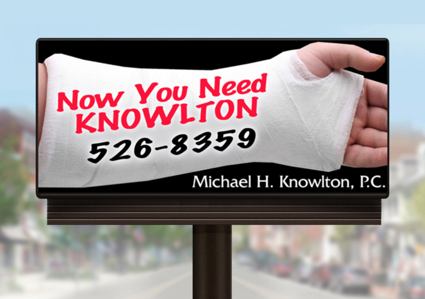
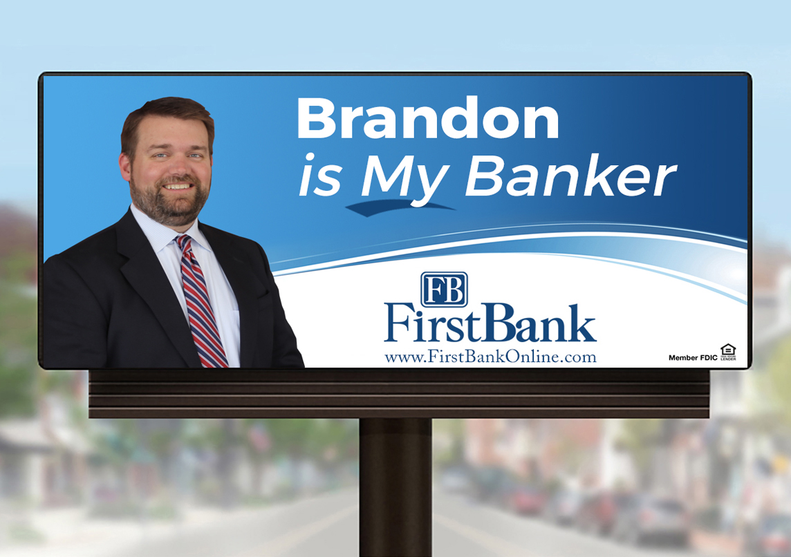
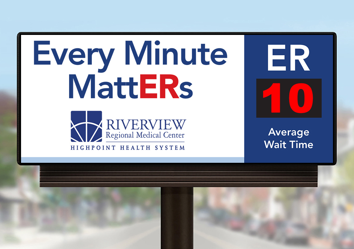
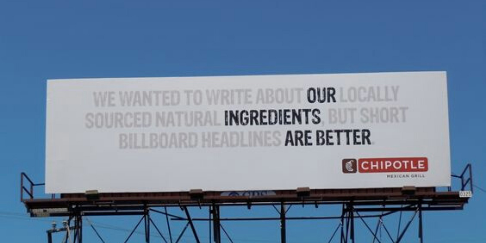
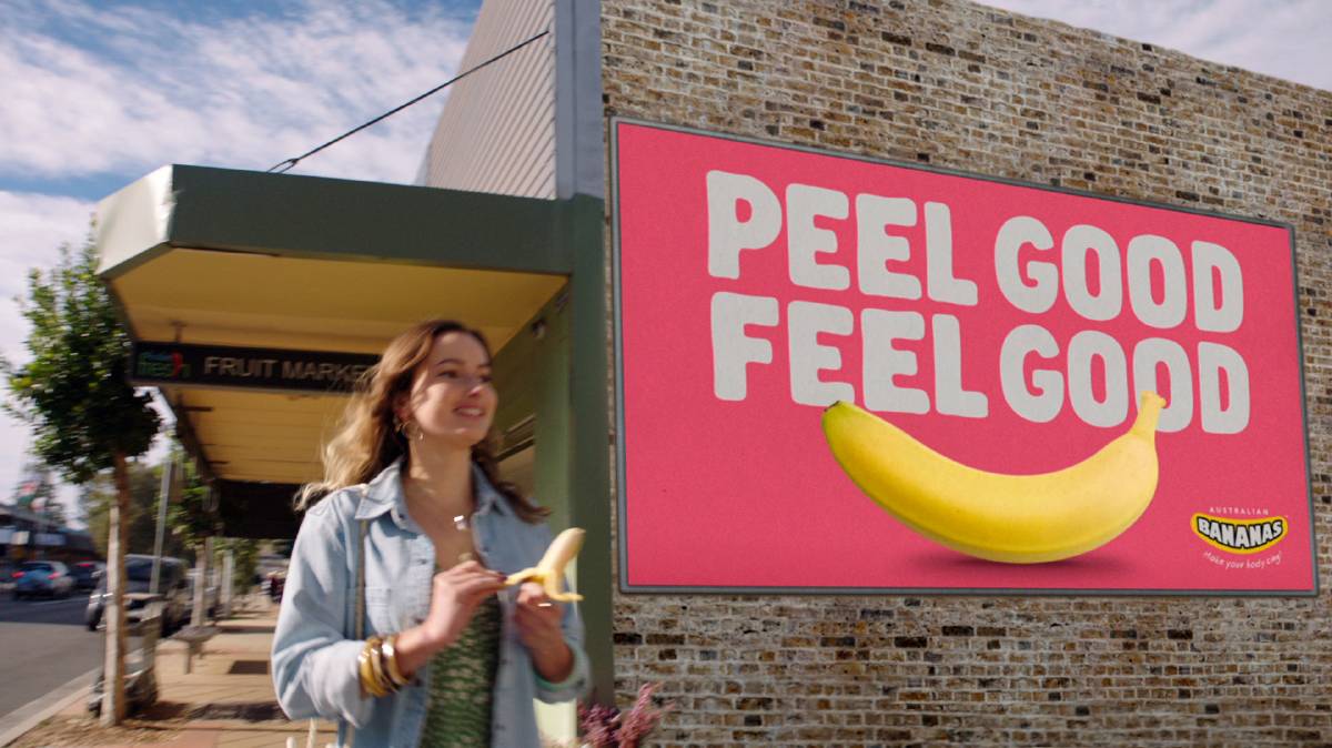
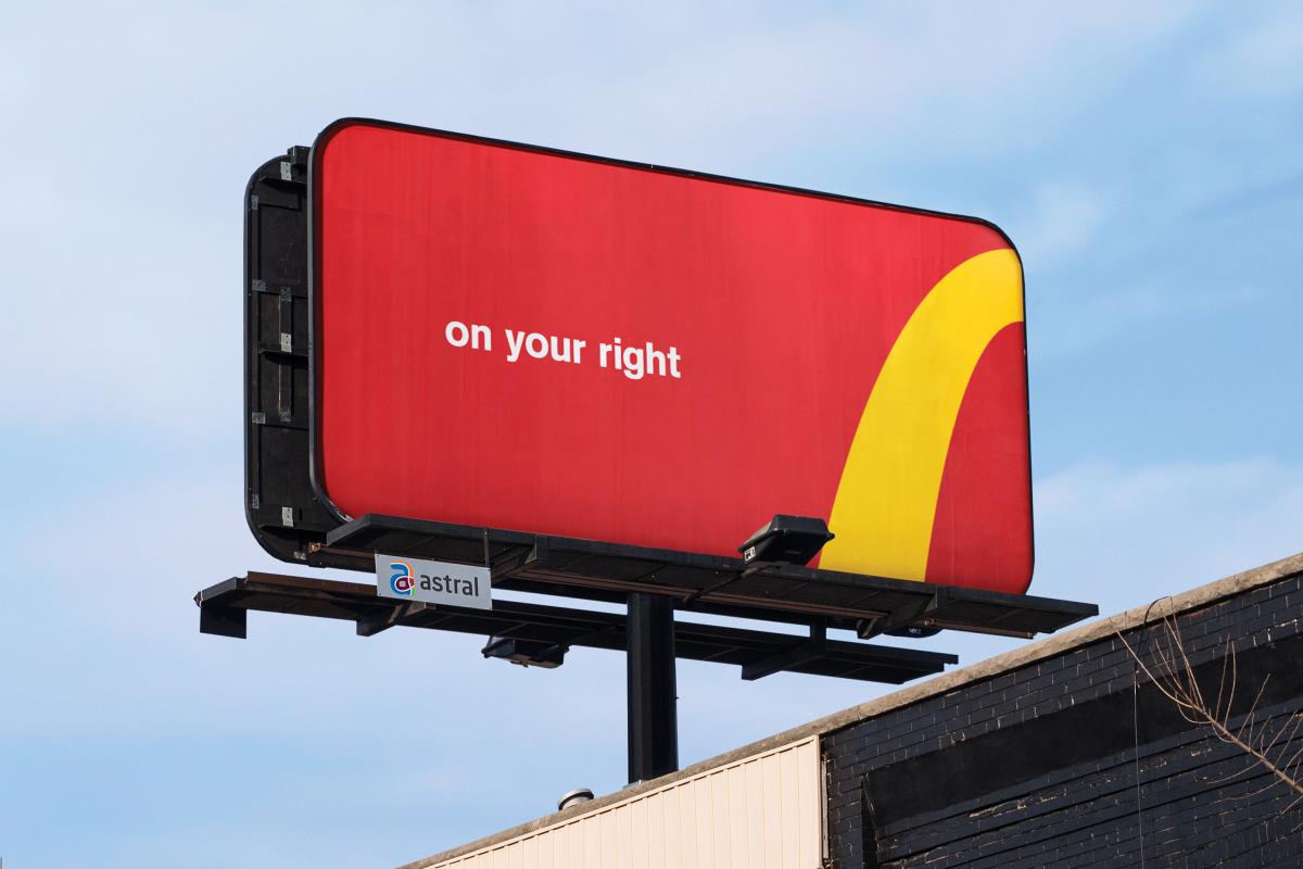
Billboard designs that nailed it!
Check out some of the creative billboard ads below. These are prime examples of ads that follow the guidelines above. They are simple, eye-catching, and memorable billboard ads. Ads like these get noticed!