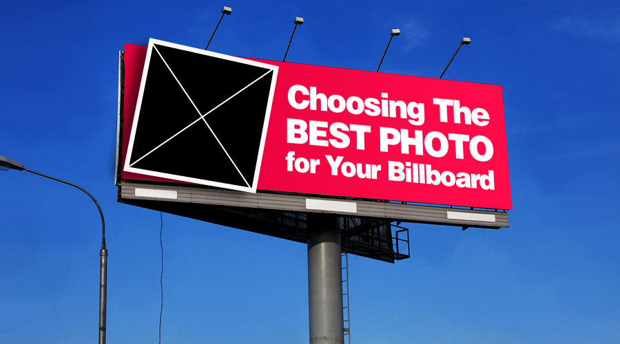
Choosing the Best Photo for Your Billboard Ad


Using photos/graphics/images on billboards is a great way to enhance your message. But choosing the right photo is critical. If it’s not easy to discern what it is, or if it’s not relatable to your message, it can have the opposite effect.
Let’s look at some tips for selecting the best photo for your billboard ad:
Use high Res Photos – Especially for static/traditional billboards. You do not want to use blurry or grainy, poor quality photos. If you are taking the photo yourself, make sure the camera is on the highest resolution setting.
Contrast/Brightness/Color – If necessary, adjust the photos brightness, color saturation and contrast. We find this needs to be done mostly if the advertiser is sending you a photo they took themselves. If possible, use stock photos, which are taken by professionals. Many of them are free and the photographer has already made sure the image looks great. We have an article on the top sites that offer free stock photos.
Photo Communicates Overall Message – Make sure that the photo goes with the message that you are trying to get across. And remember that drivers only have so many seconds to see the message. It should be simple and not too busy.
Quality over Quantity – It may be tempting to use more than one photo on your billboard ad… and your advertiser may have even requested it, but unless it is vital to the ad, we recommend using only one photo per billboard ad. This ensures the photo, verbiage, and logo will be large enough on the ad. Sometimes it is our job to communicate this to the advertiser.
If you would like to buy a bundle of stock photos for a great price, see your option here.