5 Ways to Talk Clients Out of Billboard Clutter
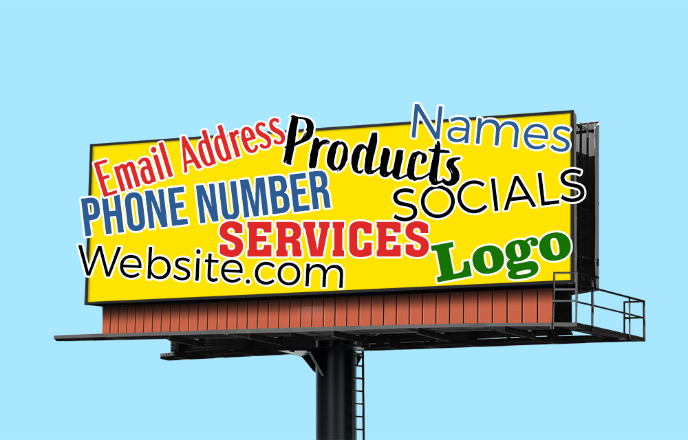


If you’ve sold or designed billboards for more than a week, you’ve probably heard it:
“Let’s add our website too.”
“We should probably mention our Facebook page.”
“Oh, and don’t forget our list of services.”
Before long, the billboard looks less like an advertisement and more like the back of a cereal box.
The challenge is that most clients aren’t trying to create a bad billboard. They’re simply afraid of leaving something out. They know their business inside and out, and every detail feels important.
Here are five ways to guide clients toward simpler, more effective billboard creative.
1. Remind Them That Billboards Aren’t Websites
One of the easiest ways to reset expectations is to explain the difference between a billboard and a website.
A website exists to provide information.
A billboard exists to create awareness and trigger action.
Drivers don’t have time to read a list of services, compare prices, or study company details while traveling down the road. The billboard’s job is simply to get attention and leave a memorable impression.
Sometimes telling a client, “The billboard should make them curious enough to visit the website later,” helps everything click into place.
2. Ask Them What Matters Most
When a client wants to include ten different pieces of information, ask a simple question:
“If someone remembers only one thing from this billboard, what should it be?”
Most of the time, they’ll identify the single message that matters most.
Maybe it’s a special promotion.
Maybe it’s the company name or brand.
Maybe it’s a catchy custom phone number.
Once you’ve identified the primary goal, it becomes much easier to eliminate the extra copy.
3. Use Real-World Examples
Many clients don’t understand billboard clutter until they see it.
Show them examples of successful campaigns from major brands. Most of the best billboards contain only a handful of words, a strong visual, and a clear brand identity.
Then compare that to an overcrowded design filled with paragraphs, logos, bullet points, and contact information.
The difference is usually obvious.
Show them this free flyer that shows ad comparisons.
4. Explain That More Information Often Means Less Impact
This sounds backwards, but it’s true.
Every additional element added to a billboard reduces the emphasis on everything else.
Adding another phone number makes both numbers less noticeable.
Adding another headline makes both headlines weaker.
Adding another image makes every image smaller.
The goal isn’t to fit as much as possible into the space. The goal is to make the most important message impossible to miss.
Sometimes removing information is the fastest way to improve results.
5. Give Them a Readability Test
This can be done several ways. One method we used was to print out the billboard on a sheet of paper, then stand across the room and try to read it. See Billboard Readability Test.
Tools like Drive Your Art offer a simulated real-world look of your billboard ad before it’s posted.
Final Thoughts
When clients ask for more copy, more services, more logos, and more information, they’re usually coming from a good place. They care about their business and want to maximize their investment.
We can channel that enthusiasm into something more effective.
A billboard doesn’t need to say everything.
It just needs to say enough.
PS: The customer is always right, even when they’re wrong.