Creating Successful Billboard Ads


Feel free to download and share this “Creating Successful Billboard Ads” flyer
(right click on it and choose save as)
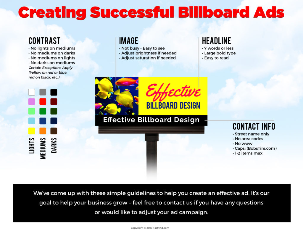
Creating a successful billboard ad is really not that hard as long as you keep these things in mind; contrast, the image, headlines and contact information. The ad keeps readers informed by keeping the advertisement interesting, but in a short descriptive way. When making the ad make it stick to the subject or object it is focusing on. If the ad has a picture, make sure it focuses on the message you are trying to get across. Remember that the motorist only has a few seconds to view and understand your message. Use contrasting colors. You do not want a dark colored words on a medium colored background as it will be too hard to read. Same goes for medium colored words on a medium colored background (red on blue). The headline should be seven words or less. Shorter is better. Bolder print helps to catch the eye, and make sure it is easy to read. Even though you can google businesses contact information, most ads have some point of contact (ie: phone, web or address), but one is best. Here are some simple guidelines to help you create an effective billboard ad:
Contrast:
-No lights on mediums
-No mediums on darks
-No mediums on lights
-No darks on mediums
But certain exceptions apply;
(Yellow on red or blue. Red on black if it’s a digital board, etc;)
Image:
• Not busy – Easy to see
• Adjust brightness if needed
• Adjust saturation if needed
Headline:
• 7 words or less
• Large bold type
• Easy to read
Contact Info:
• Street name only
• No area codes if possible
• No www.
• Caps on web address (BobsTires.com)
• 1-2 items max
It’s our goal to help your business grow – feel free to contact us if you have any questions!